An Insider’s Look at Pico, Alto and Hop

It’s been a few months since we launched the three new Water Journey™ designs so we are getting back into the groove!
A couple of weeks ago, we spoke with Vortex’s industrial designer Juliana Hamori, the mastermind behind Pico, Alto and Hop. We also sat down with project designer (and landscape architect specialist) Scott Stefanc, to learn how he integrates Water Journey™ into different Splashpads and aquatic playscapes. With our three experiences now officially launched, we wanted to check back in with these creative minds and get their musings on the new designs.
We hope their special insight inspires you on this last stretch of our Water Journey.
Hi guys! Thankfully, the veil of secrecy has finally been lifted. We look forward to hearing what you have to say about these new designs. To get the ball rolling, Juliana, how did Pico, Alto and Hop come to be?
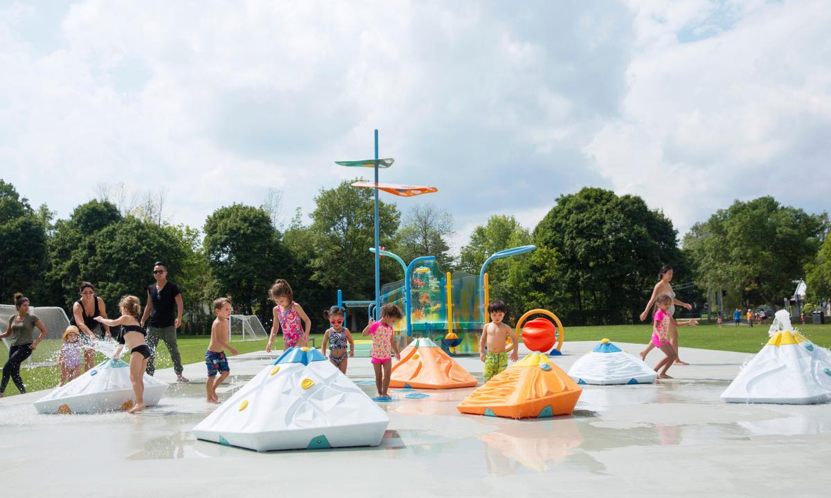
Juliana: I wanted to break from Splashpad’s ground-level experience using something a little more voluminous and tactile. During the very early stages, the other designers and I were thinking of something along the lines of a bay or an island—a space younger kids could call their own. We began experimenting with round shapes and abstract formations. From there, we explored textures and things began falling into place.
How did you go about choosing the materials and color schemes for Pico and Alto?
Juliana: At first, we debated over whether we should continue with concrete (like the rest of Water Journey) or look into something different. We knew that we wanted to play with colors and interesting depths, so we eventually turned to polyethylene. It’s a much more versatile material, perfectly suited for the types of formations we wanted to create. Colors are such an important part of the experience. We use soft, serene hues but also incorporate deeper, contrasting colors to attract younger kids to the different features.
Where do you see these new designs taking off? Commercial, municipal?
Scott: It’s interesting because they can be appropriated in different ways. In urban environments, they’re going to be a big hit. For instance, think about public parks. Pico, Alto and Hop all have this cultural, public-art quality to their shapes that would mesh very well with, say, an urban plaza or city center. At the same time, the design quality of these experiences also lends itself well to municipal parks, hotels and resorts. There’s a lot of excitement, movement and visual stimuli that will be a big draw for wet decks and Splashpads.

How will Hop fit into the grand scheme of things?
Juliana: Hop adds this layer of physical fun to the experience. It also ties in with Water Journey’s central theme of basic, bare-bones play. Hopping on stones is one of the oldest games there is. The design’s mechanics reflect the types of activities young children are already familiar with (i.e. hopscotch), which makes everything highly intuitive.
Scott: You can’t talk about a journey without talking about motion. Hop encourages movement within the space. I love the idea of a child playing in a puddle or jumping in a stream but without any of the inherent risks.
Juliana: From day one, we knew that we needed a path of some sort that could integrate with these new formations. Every good journey needs a path.

Finally, what’s got you most excited about Pico, Alto and Hop?
Scott: Our industry is always looking for something different, something new. Sure, we’ve seen creative designs that incorporate sprays into natural features like rocks, which can look great, but this is different. These designs aren’t merely decorative; they’re safe, perfectly scaled and meticulously crafted to engage with a unique age group. At the same time, they remain eye-catching in a way that also appeals to a broader demographic.
Juliana: They offer a totally new vibe. We’ve pioneered Splashpads and Elevations. Now, we’re introducing transitional elements into the landscape. These different dimensions will change the water play experience entirely. I’m also excited about releasing a design that celebrates simplicity. From the start, we aimed to create familiar, simple play interactions. It was a challenge. Often, there’s a push to keep adding new features. It’s our adult brains—we want everything to be fully loaded. But children, especially toddlers and preschoolers, aren’t looking at play experiences the same way we are. Thankfully, our designer intuition kept us on track. I’m really happy with the final product!
Scott: For me, what’s really exciting is the prospect of putting all these unique elements together. Pico, Alto and Hop aren’t stand-alones; they’re very much part of a larger story. When I first heard about the new designs, it was like having just finished a really good novel and then learning that a sequel was in the works. You get to revisit all your favorite characters, meet a few new ones and set off on an entirely new adventure!


